How might we help people discover concerts and buy tickets?
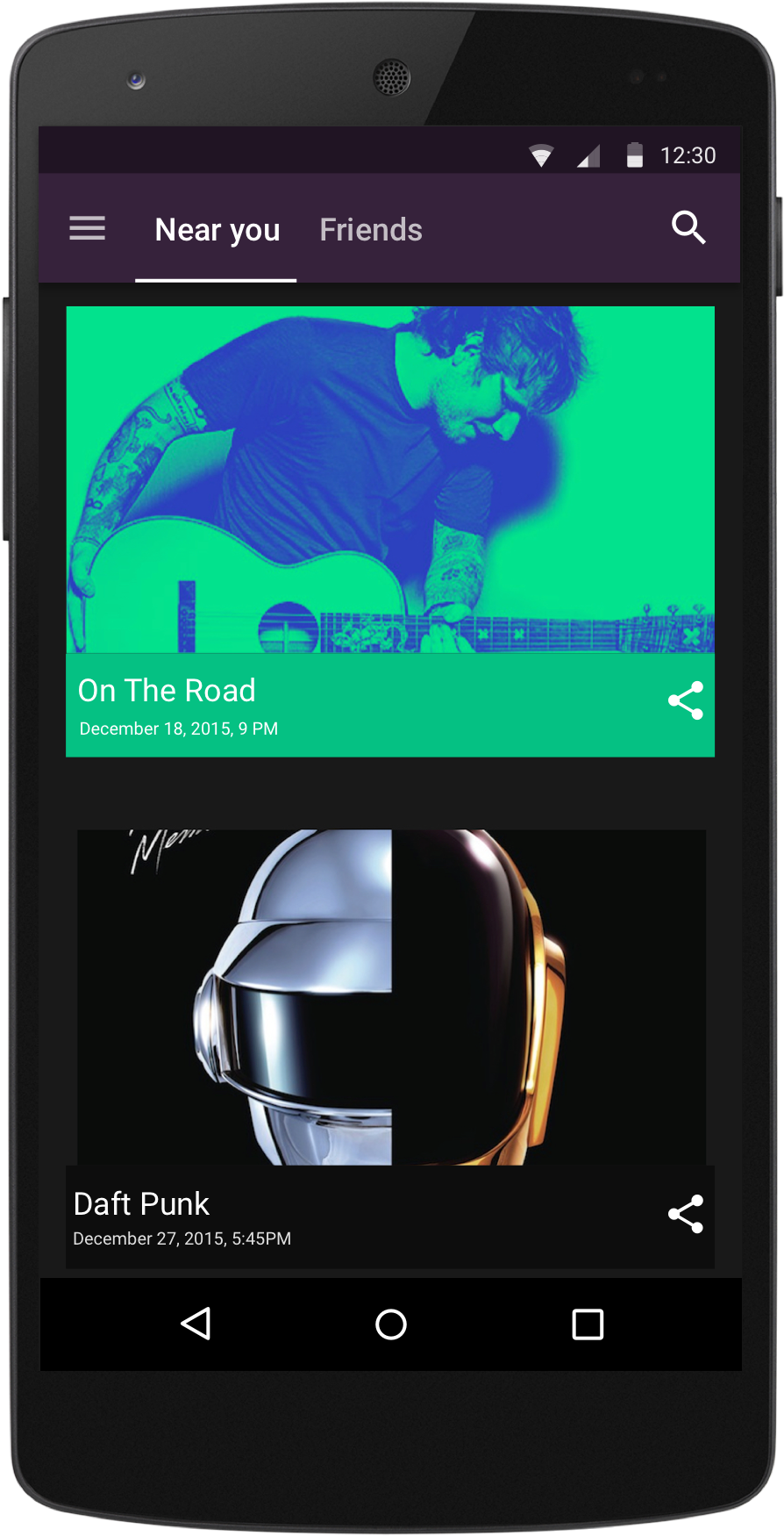
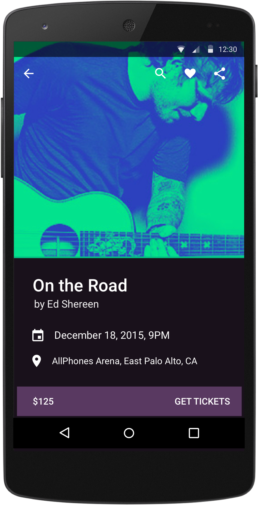
Discover near you
Ticketpass let’s you explore concerts happening around you and keeps you updated. You don’t have to hunt for concerts.
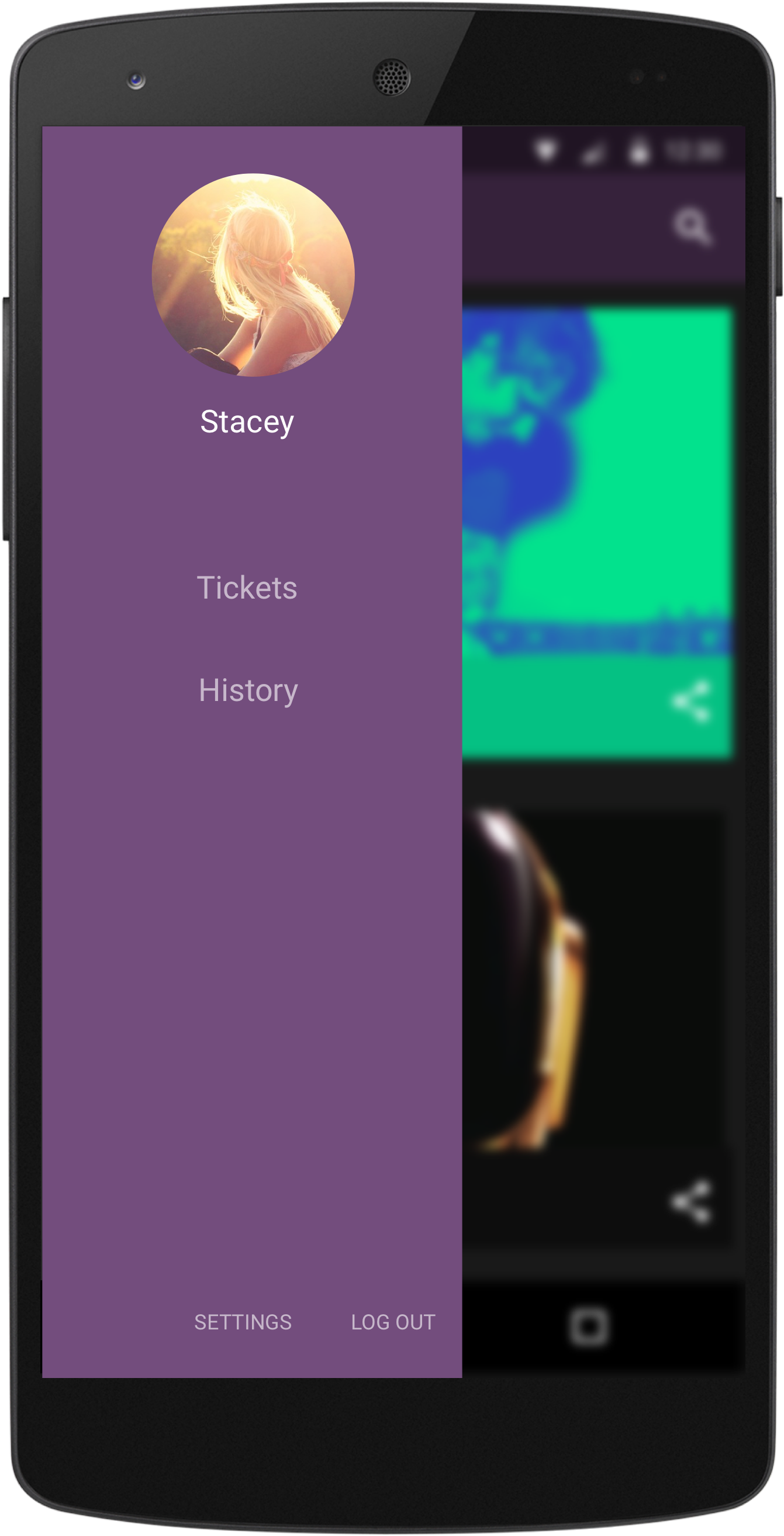
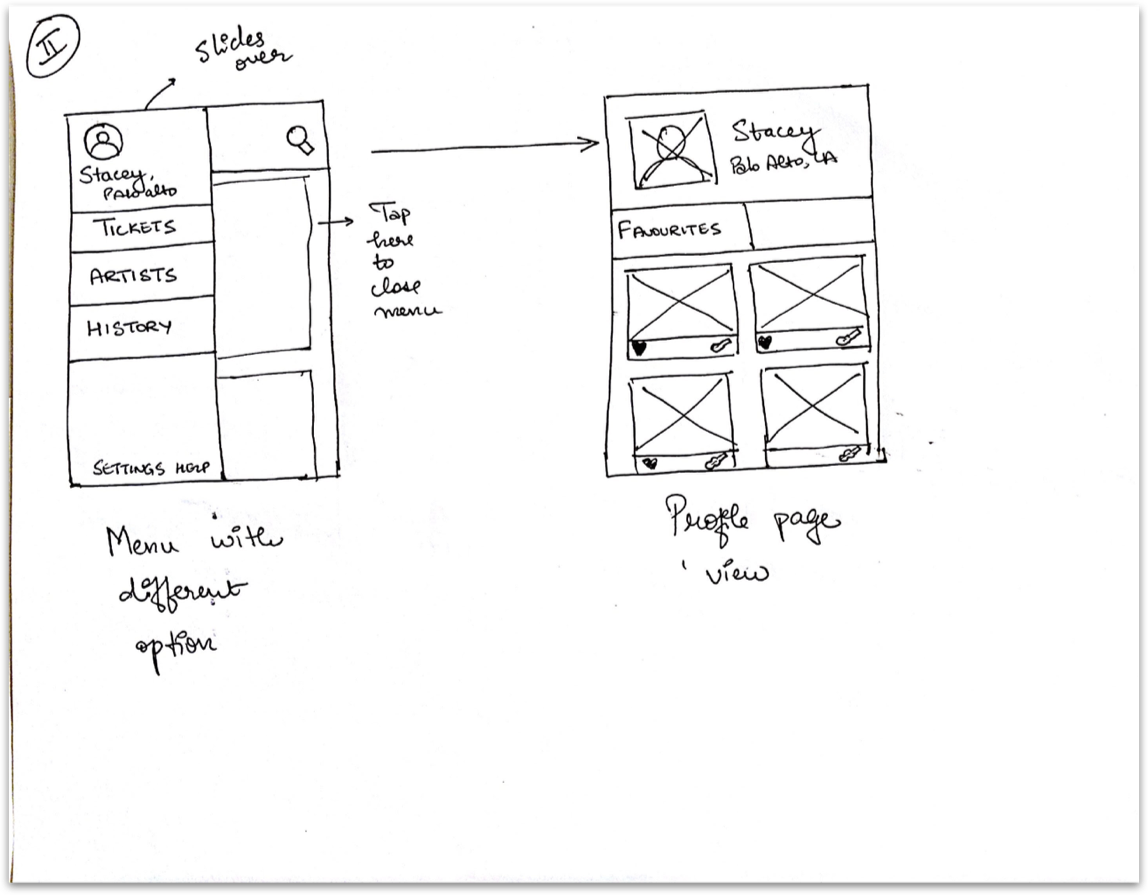
Tickets have a home they deserve
All your concert tickets live safely and are easily accessible with one tap. Don’t cha worry about where your ticket went while boozin’!
Take Spotify with you
Doesn’t it make you swoop when someone loves the same song as you? Yup. Integrate your Spotify playlist and you’ll get recommendations based on the music you love.
Favourite concerts for later
Sometimes its hard to commit without letting your friends know. Don’t worry, we got your back. Favorite concerts and prioritize them for later.
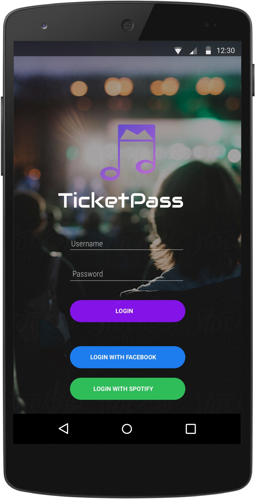
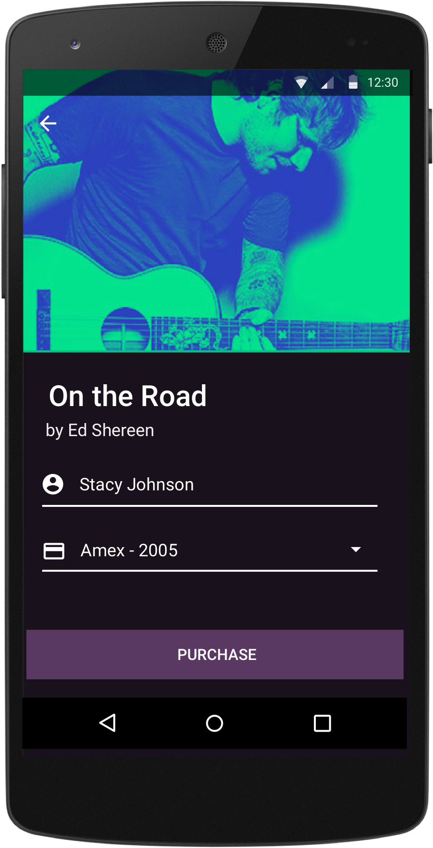
One-click purchase
Don’t worry about spending time in adding a payment method every time. Verify your name, tap purchase and get on with your rockstar life.
Concept
Very early stage exploration. To explain the concept to some of our users, we went ahead and created a mock movie from featuring an inVision prototype.
Branding
Intro
The essence of this app is user's love and attachment to different kind of music. The logo is inspired from musical notation which is independent of any particular instrument or system.
Logo and icon
Colors

Fonts

Process
Role
Branding / Visual and interaction design / Wireframing and prototyping. I collaborated with an Android developer.
Ticketpass was done in 2015 within a brief period of 3 weeks.
Problem and the Why
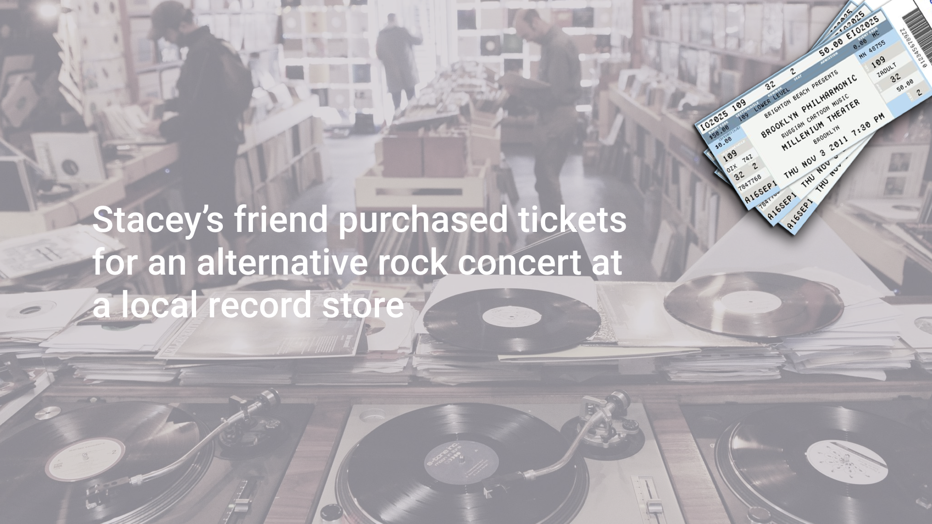
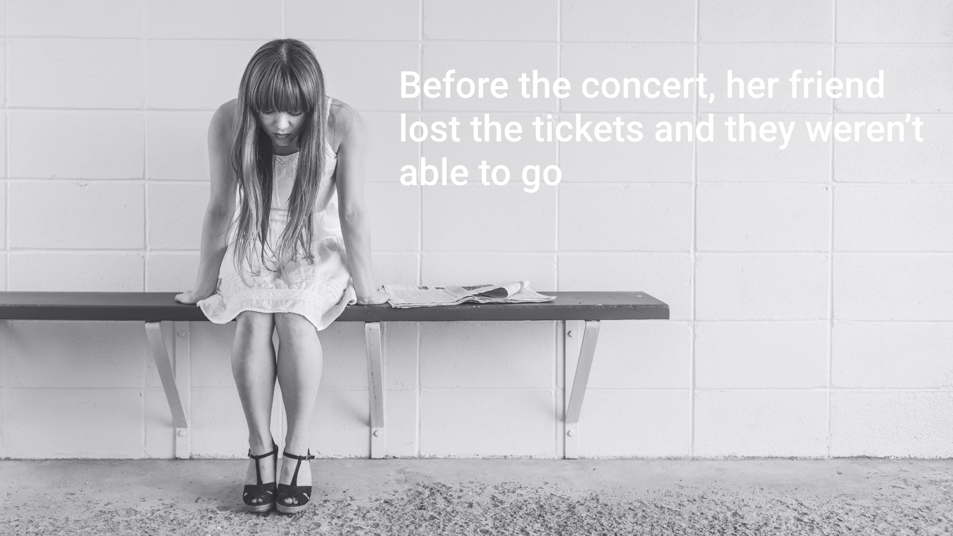
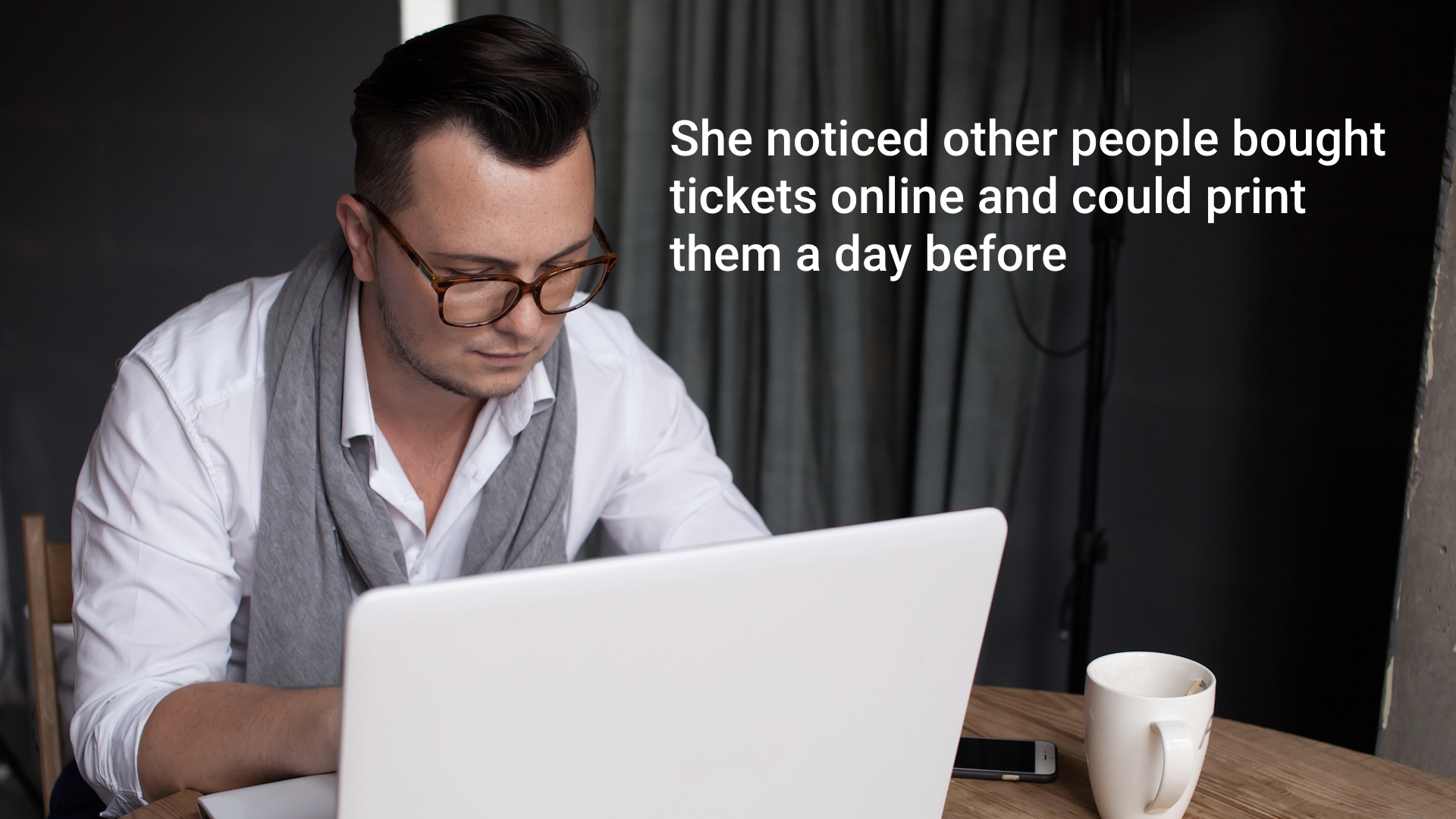
To understand the problem our user Stacey is facing, let's look at the problem scenario below. Click 'next' to move through the story.
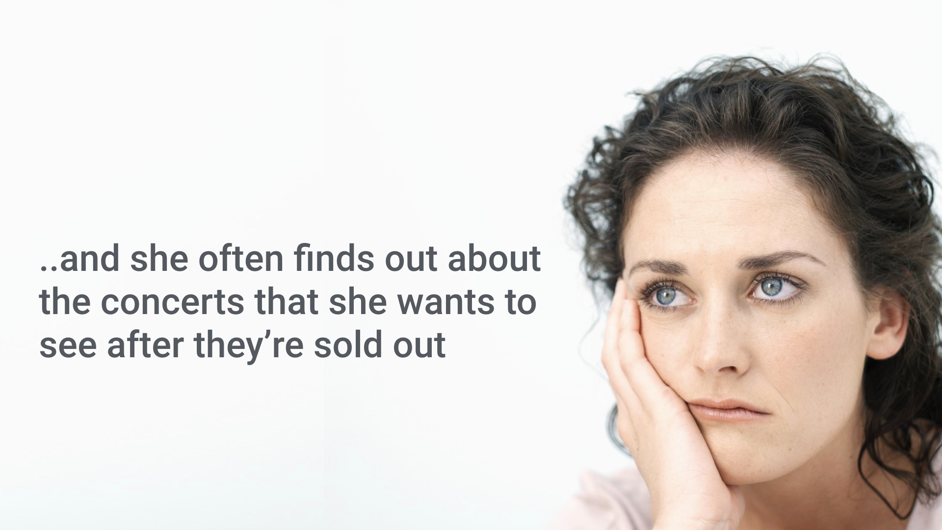
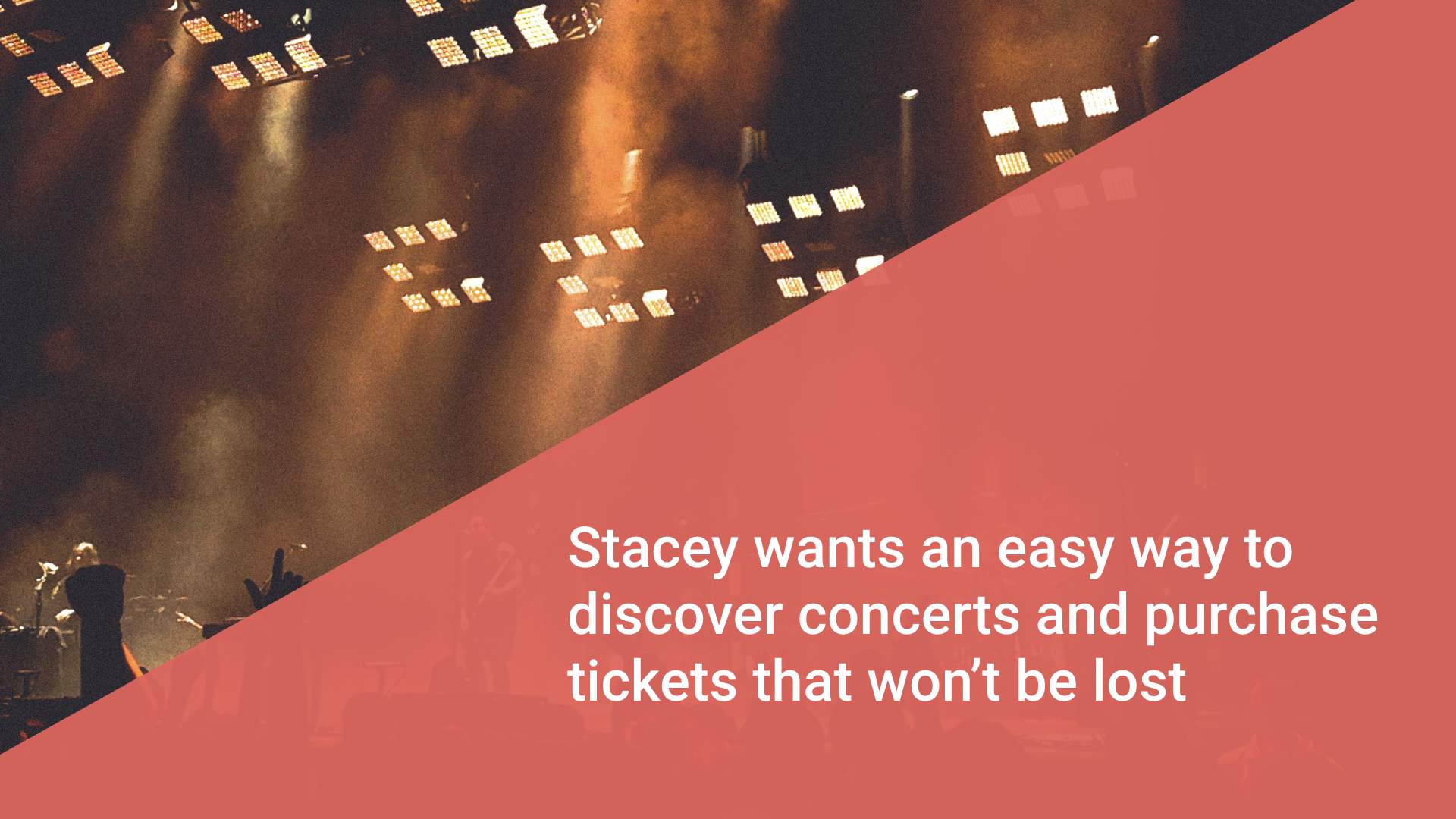
As you saw in the above story, there is a need for a solution for Stacey which can help her save tickets and discover concerts around her. As a part of my exploration process, I took Livenation, Songkick and Bands in town into account and I found out that in addition to using third party integrations/dependabilities, these apps lacked a social component which makes them good for only intermittent use.
So, the overall goal of ticketpass was to fill that gap and introduce a couple of things: Discoverability towards concerts, social connections and sharing without leaving the app. I started with a vision of Ticketpass handling everything about concerts for the user.
Persona
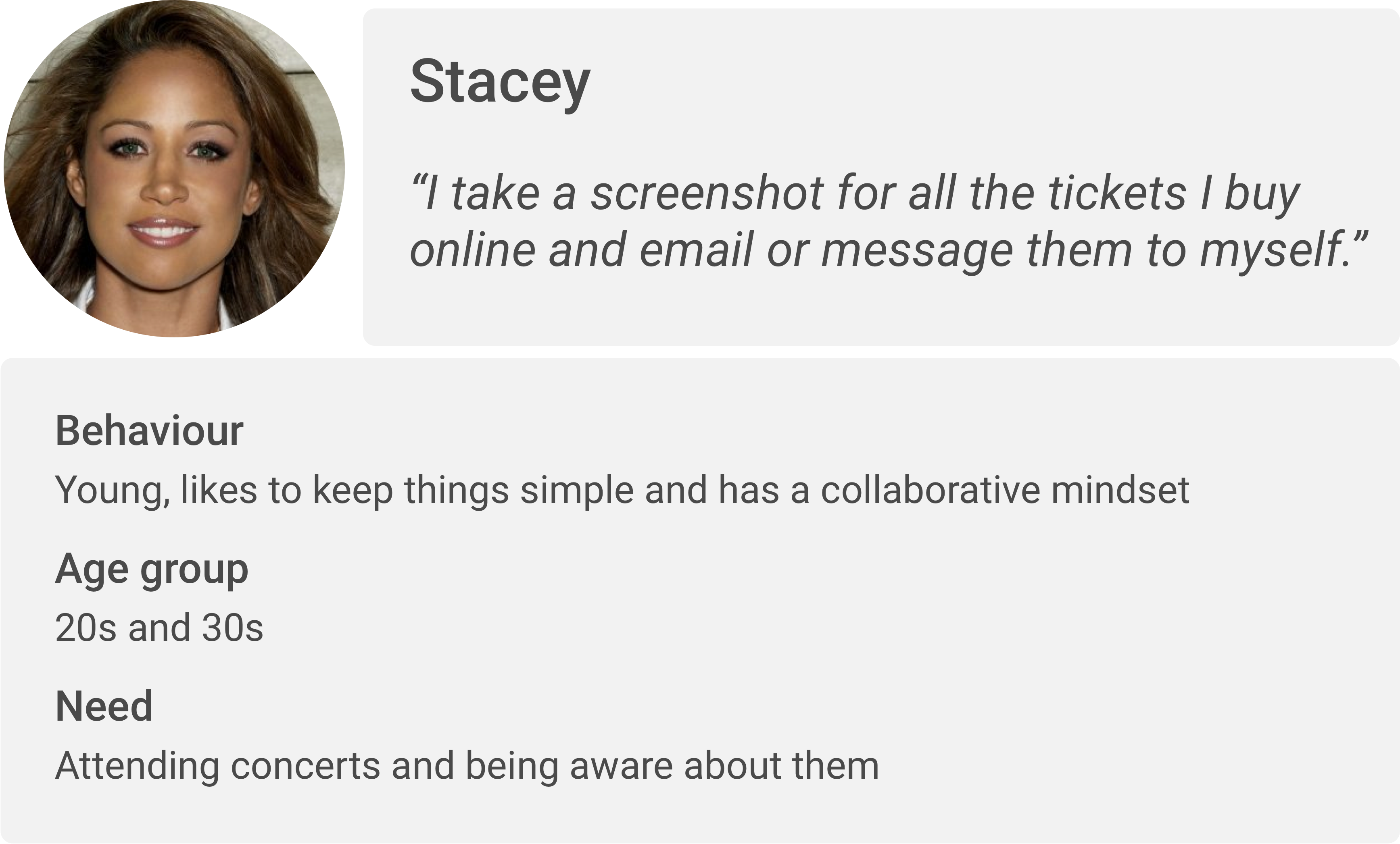
Interesting quotes
"I get hungry with all the dancing. When I go to buy food, I end up in a line. Maybe this app could help me order ahead?"
"I use my email as a dump for all the tickets I have bought. Sometimes I put an event on my calendar so that I remember about the concert!"
"My friends usually create a Whatsapp or a iMessage group with everyone going to the concert. We plan ahead so that we're never bored!"
Identified tasks
- Find and view concerts near the user
- Purchase concert tickets and search to retrieve them
- View past events attended by the user
- Share and connect users with similar interest
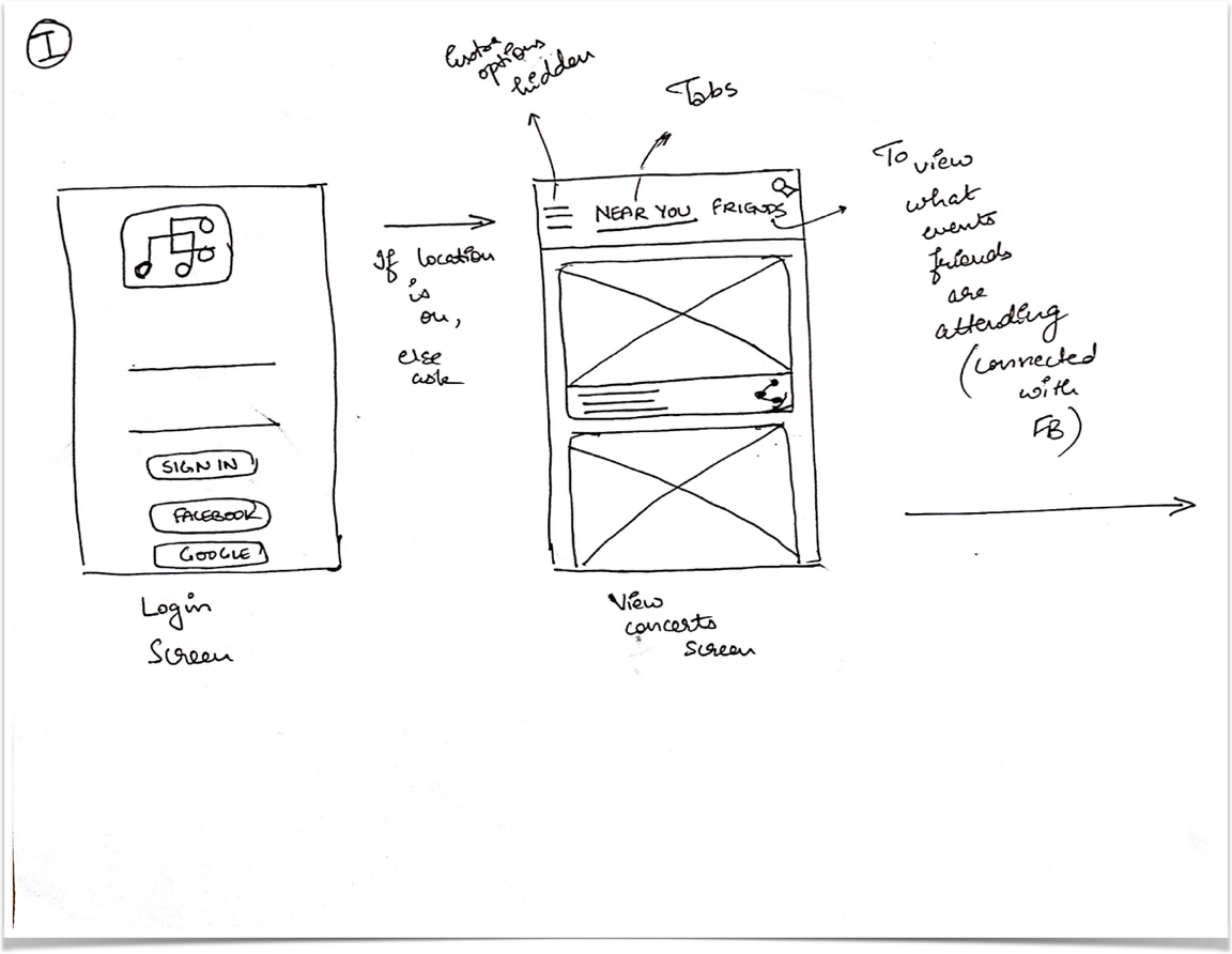
Interaction flow

Sketching
Card explorations
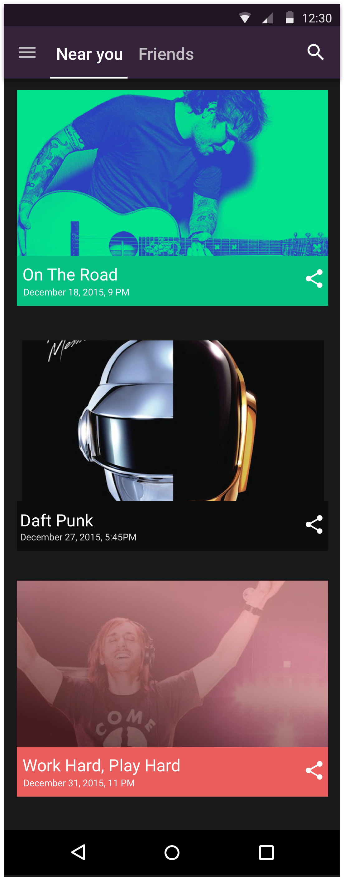
As a part of discovery and explorations, I tested three card interactions for the landing page for TicketPass
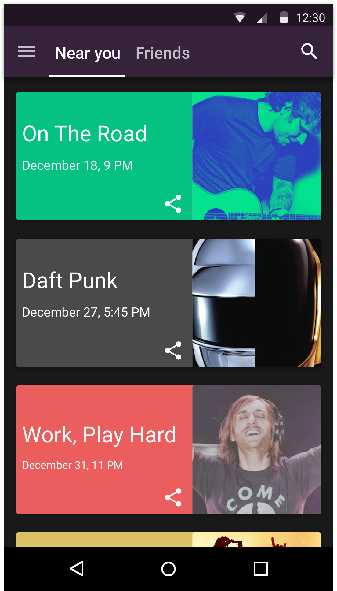
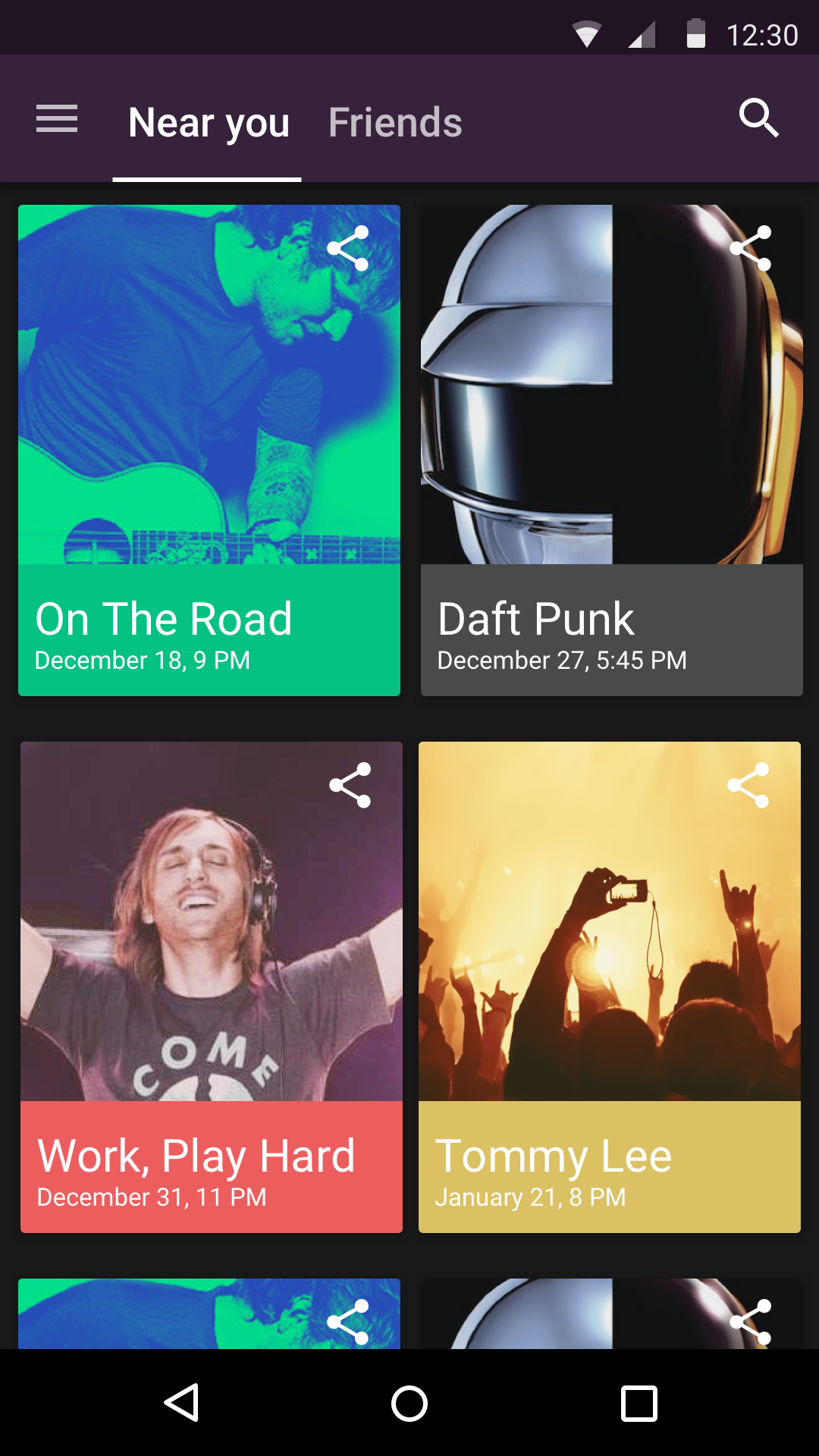
Full-width cards allow the user to view two concerts in a single view above the fold:
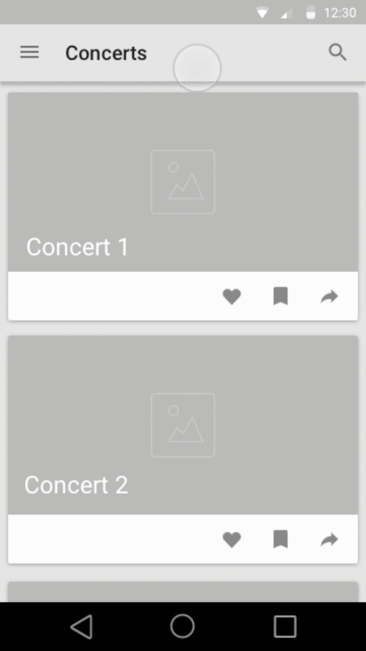
Cards as a list give a scroll friendly view which allows for a balanced full-width view with multiple cards above the fold:
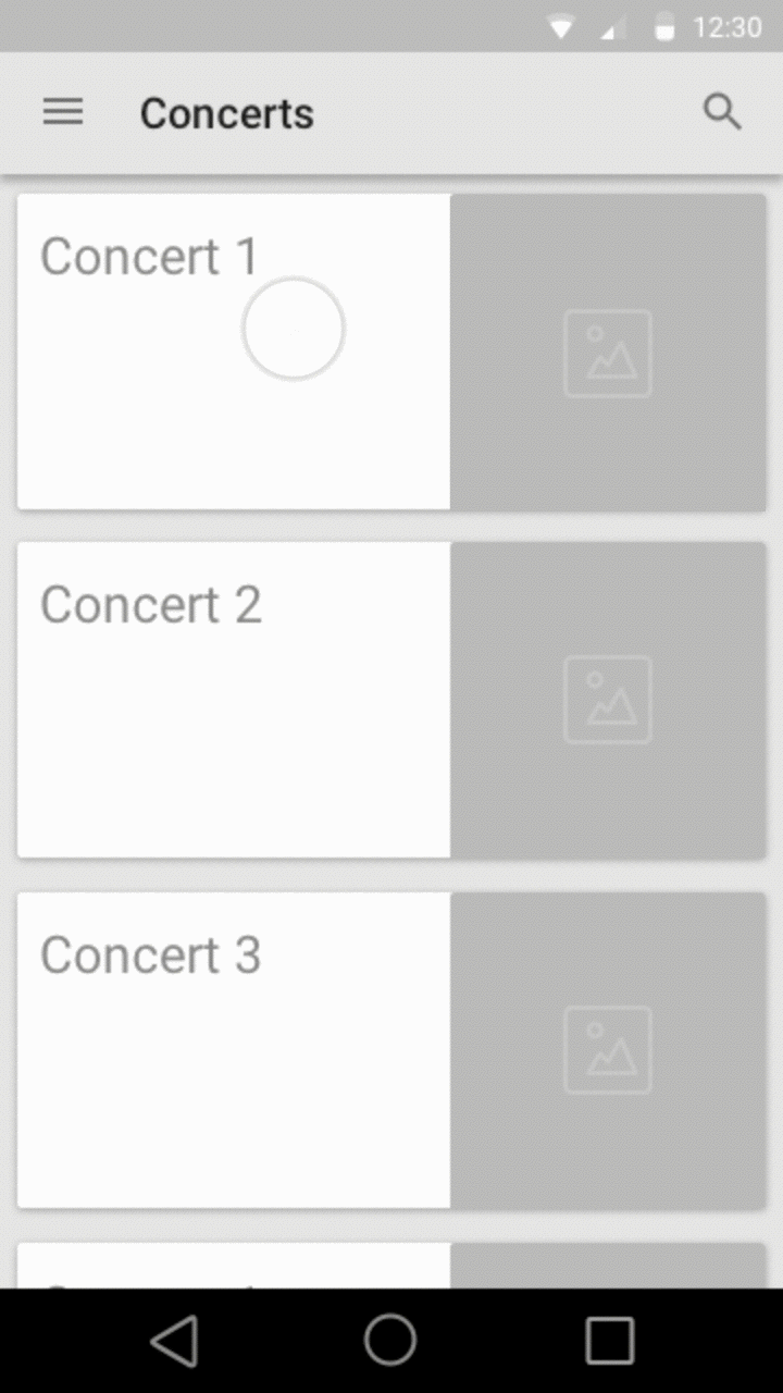
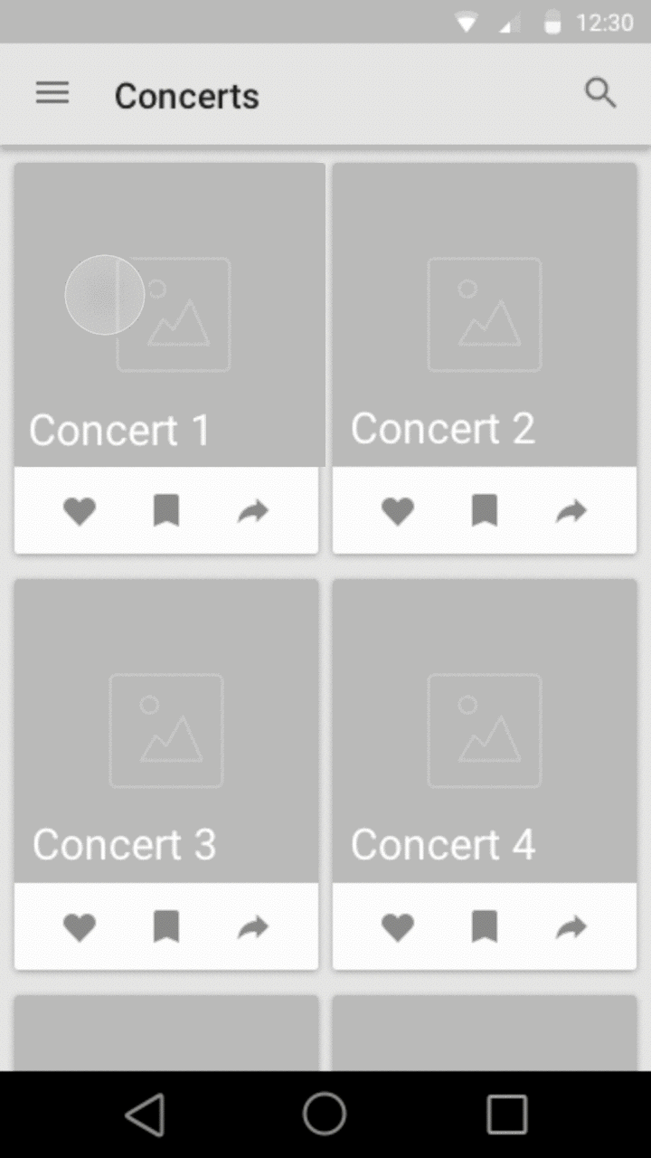
Two-column grid allows for an evenly balanced grid with upto or more than four cards above the fold but creates a lot of visual noise on the screen:
Testing
Out of the 35 users I interacted with:

Further action items and reflections
- Design for a social share feature which including sharing photos
- Test “#hashtag to flag and share” concept
- Account for empty state - What happens when there are no concerts around the user?
- Gather feedback from the larger design community and align the design files to material design guidelines
Within a brief a period of 3 weeks, I feel we made great progress with taking our concepts in front of users early. I can't bring out the developed concept in front of you at this point since we plan on picking this up again in the near future, but having said that the biggest highlights of this project was collaboration with a developer and welcoming his ideas into my brainstorming sessions. It is very interesting how developers are able to think of so many edge cases at once!
We couldn't complete this and bring it to life back then because of our work commitments. I have to admit that with time, we started questioning our approach, validity of our concept and whether it is going somewhere or not. We were moving so fast that I, as a designer, did not invest enough time in validating the problem and focusing on the value prop. I could have been more thorough with designing the experience now that I look back at the overall 3 weeks.
Nonetheless, it was a great learning experience and we hope to solve a deeper problem this time!